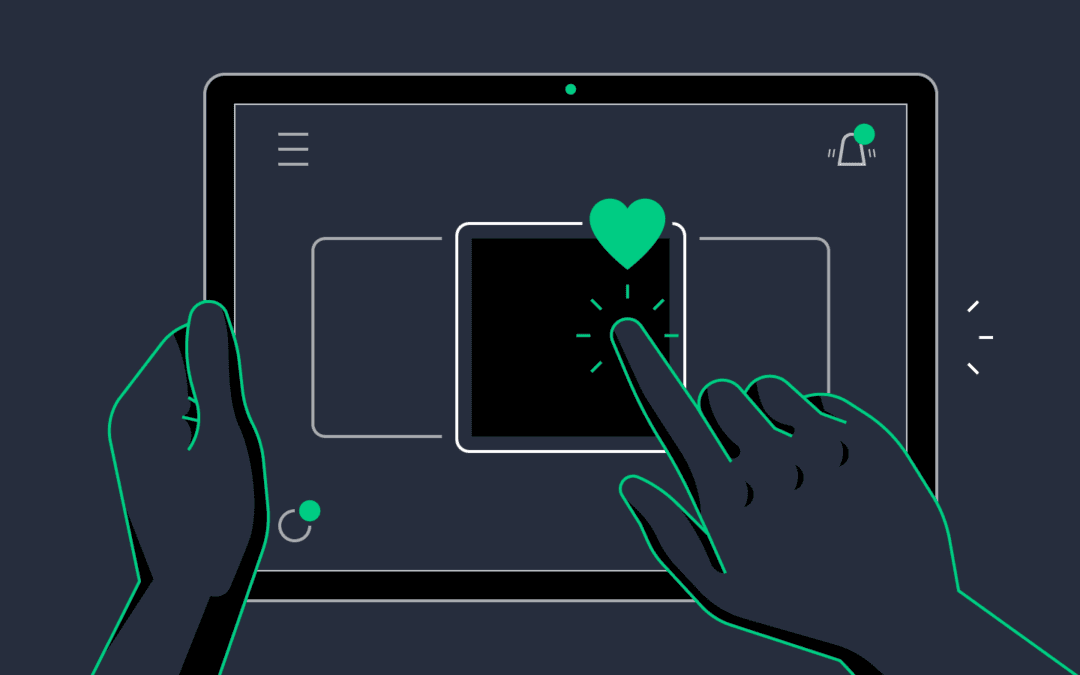
In the ever-evolving world of web design, the devil is often in the details. While major elements like layout, color scheme, and typography grab headlines, it’s the subtler aspects—like micro-interactions—that truly elevate a user’s experience. Micro-interactions, those tiny animations or responses to user actions, have grown from being a novel trend to a crucial element of modern web design. Let’s dive into what they are, why they matter, and how you can effectively incorporate them into your projects.
What are Micro-Interactions?
Micro-interactions are brief, often subtle animations or feedbacks triggered by user actions. Examples include the ‘like’ button on social media platforms, the swiping action on a touchscreen, or even a simple hover effect that changes a button’s color. They are designed to engage users, provide feedback, and guide them through a website’s interface intuitively.
Why Do Micro-Interactions Matter?
Enhancing User Experience: Micro-interactions make interfaces feel more intuitive and engaging. They provide immediate feedback, showing users that their actions have been acknowledged, which is crucial for creating a seamless experience.
Guiding User Behavior: By giving visual cues or feedback, micro-interactions can subtly guide users towards desired actions, such as completing a purchase, filling out a form, or navigating to another page.
Adding Delight and Personality: Well-crafted micro-interactions can add a touch of personality to a website, making it more memorable. They can also make mundane tasks more enjoyable, increasing user satisfaction.
Providing System Status: These interactions can indicate the status of a process, like a loading spinner or a progress bar. This keeps users informed and reduces uncertainty, leading to a smoother experience.
Key Elements of Effective Micro-Interactions
To effectively incorporate micro-interactions into your web design, consider the following elements:
Triggers: These are the events that initiate a micro-interaction. They can be user actions (like clicking a button) or system changes (like an incoming message notification).
Rules: These define what happens once a micro-interaction is triggered. For example, hovering over a button might change its color.
Feedback: This is the visual or auditory response that users see or hear. Feedback ensures users know their action has been recognized.
Loops and Modes: These control the duration and repetition of a micro-interaction. For example, a loading spinner might loop until the page is fully loaded.
Best Practices for Using Micro-Interactions
Keep It Simple: Overloading a website with too many micro-interactions can overwhelm users. Use them sparingly and purposefully.
Maintain Consistency: Ensure that your micro-interactions align with the overall design and branding of your website. Consistency helps in creating a cohesive user experience.
Focus on Performance: While animations can be delightful, they shouldn’t hinder the performance of your website. Optimize your micro-interactions to ensure they load quickly and run smoothly.
Test and Iterate: User testing is essential to understand how your micro-interactions are perceived. Gather feedback and be prepared to iterate on your designs.
Conclusion
Micro-interactions may be small, but their impact on user experience is significant. By carefully designing and implementing these tiny animations and feedbacks, you can create more engaging, intuitive, and delightful web experiences. As the digital landscape continues to evolve, micro-interactions will undoubtedly play a crucial role in shaping the future of web design.
Whether you are a seasoned web designer or just starting, understanding and leveraging micro-interactions can set your projects apart, making your designs not only functional but also enjoyable to use.


Recent Comments